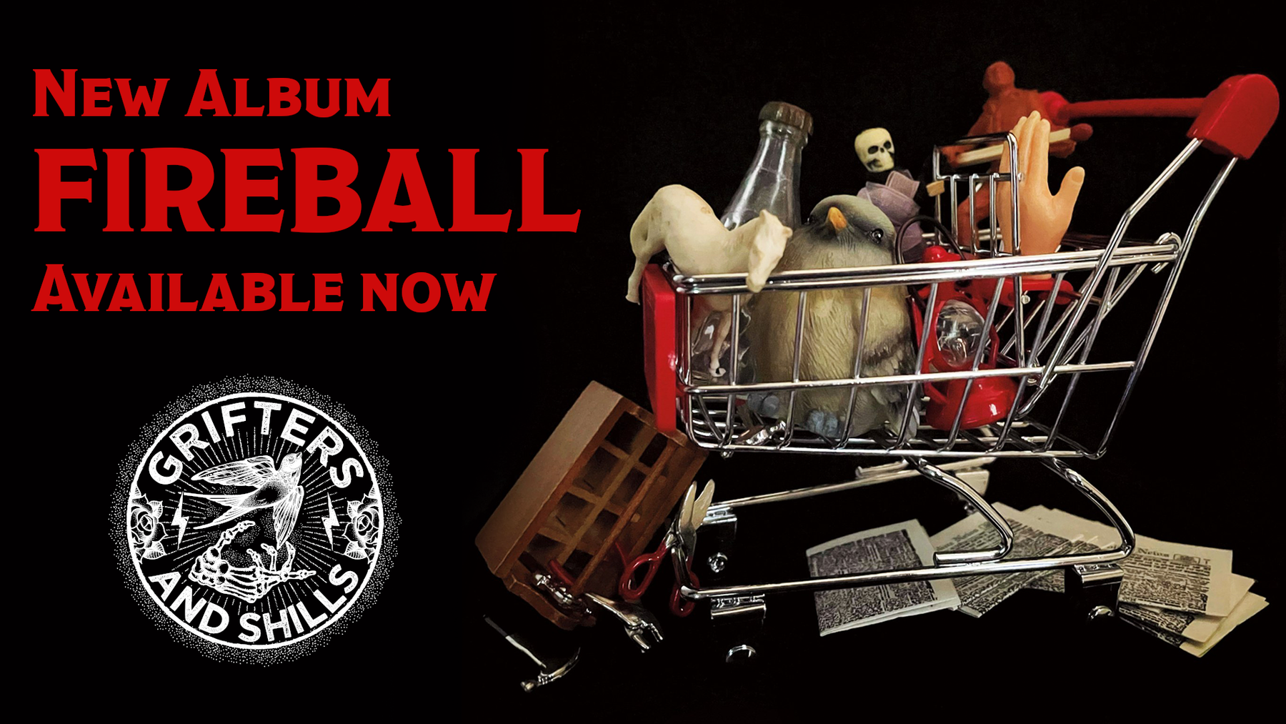
This month, we’re officially unveiling the artwork for “Pretty Little Secrets” (though many of you have probably glimpsed it on social media by this point, or we just couldn’t wait and gave you a copy already). We adore this design. It’s the second time we’ve worked with an artist to conceptualize an album, and we just couldn’t be happier. One, because the design is phenomenal, and two, because there is no kinder, more talented soul we could have had the pleasure of working with.
We were very fortunate to have the opportunity to work with John Streeter to design this album and give a face to the songs and the concept as a whole. John is a longtime friend of the band, and we knew that his talent and style were up to the task of finding a face for this record. We recently sat down with John and asked a few questions about the process. We thought you might enjoy a look behind the scenes at how this art came to be, and get a little insight into the design from the artist himself.
How do you know John and Rebecca? 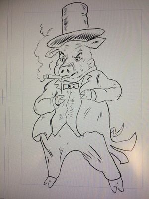
Streeter: John and I have worked together for many years. I knew him as an audio engineer first; he recorded audio for many of my video productions for NASA. One of my favorite John memories is when we had the crew standing out on the runway at Edwards Airforce base as a B-52 bomber took off. John rode the audio as the engine roar reached a peak and then slowly disappeared into the clouds. I knew he was a musician, but when I heard him and Rebecca together I was really amazed. I love the way they look at each other in the middle of a song, like some secret dialogue is going on between them that only they know. I have always been impressed with how they juggle being recording artists, performers, and music producers, and still hold day jobs. Through it all they are the nicest people I know, not to mention some of the most talented people I know.
Tell us a bit about you. How did you get into drawing, and who are some your influences? 
Streeter: I got into drawing through my dad. He was in WWII and used his G.I. bill to study commercial art. Back then, many of the magazines and periodicals used painted art instead of photography. The illustrations told the story in subtler ways. There were always art books around the house, and then through comic books, I became really interested in drawing. My dad gave me a lot of pointers. I was just a kid but he was really strict on shading, proportion, perspective and other techniques. He really knew a lot about fine art. He would bring me a lot of pads and pens from work and I would create my own comics. At first it was just kid stuff, and then one day, one of the panels turned out really good and from then on I was hooked. He got a big kick out of the hours I would spend making those books. That's how it got started for me. My degree was in television production, but I always used my art skills in my productions, whether it was storyboards or graphics. I did study art later on at the Glassell School and really enjoyed it. Most of my art was on paper, but in the past few years, I have transitioned to creating digital art, which brings us to today.
How did the idea for the art design came about?
Streeter: I've always liked the name of the band--Grifters & Shills. They played roots music, and the name evoked that time period where I imagine traveling shows of snake-oil salesmen, selling their wares and getting out of town before their concoctions were discovered as fakes. You know, you can picture a bald guy yelling, "Hey! This hair tonic doesn't work!" or "My bunion still hurts!" and then you cut to the grifters hightailing their wagon out of town, laughing all the way. I started thinking, "what other kind of people did that type of trickery?" and came up with the idea of magicians, and those guys who would hold seances, supposedly making contact with the spirit world for rich old millionaires. This became the theme of the album art. I would have one of these phony guys with painted-on eyebrows, maybe a big phony mustache, conjuring up spirits around a crystal ball. The imagery swirling around him would all relate in some way to the songs in the album. I showed John and Rebecca some early sketches of what the layout could be and everyone agreed this was the way to go. I was really excited with the concept because it related to the band name so well.
Were there any lyrical themes or particular songs in the recordings that inspired your design for the album? 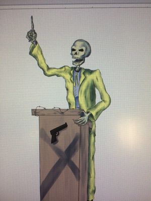
Streeter: When John and Rebecca first approached me to make the album cover, my first question naturally was, "what's the album about?" They gave me the lyrics to read over so I could get a better understanding of where they were coming from. I was blown away. The lyrics alone were like poetry. The stories were rich and interesting. There was deceit, greed, love, humor, and a touch of ghastliness too. Then they played me some early mixes of the songs! There was a new level of depth to their sound I had never heard before. Listening to the textures and moods they created in the mix really helped stir up some imagery in my head.
What was your process for creating the art? Did you draw it digitally, or by hand?
Streeter: The artwork began by hand, with a pencil sketch. Later, I started working one piece at a time digitally. Working digitally, I became very focused on each element. At the end, I started bringing the magician and all his conjurings together, then made another pass of a swirling mist reaching out and tying all the pieces together. An important part of this assignment was that the artwork would be featured on a full-size vinyl LP cover. To me, one of the joys of vinyl is the large real estate you have to work with, and just staring at it as you listen to the album. That alone is an experience unto itself as you daydream, escape into the album and just study that cover as the music overtakes you. This means the cover should have a lot of elements for the viewer to look at and ponder, "Which song does this character relate to?" or, "I wonder what that character's story is." As of this writing, I have seen the art on a CD cover and was pleased but am looking forward to seeing the LP. I can't wait to lower the needle onto the vinyl, and then have that experience of studying the cover as I listen. I am really appreciative for John and Rebecca giving me the chance to work on this project. The lyrics, their performances, and the incredible mix are a powerful combination that serve the songs so well and showcase their talent reaching a new height. They inspired the artwork from beginning to end.
As an artist, what's the best piece of advice you've ever received? 
Streeter: If it brings you joy, do it. I really enjoy making videos. I really enjoy making art. I'm very lucky to be able to do both.
Is there anything else you'd like to mention that we didn't ask?
Streeter: I am very excited about the release of this album. I continue to be stunned by the quality, talent and emotion John and Rebecca have poured into these songs. I've enjoyed all of their releases but this latest is a huge step up in their evolution as artists. I am very humbled to have been asked to make the artwork for them at what I believe is a pivotal stage in their career. Thank you guys! A running joke we have is John often says, "When we run into a problem on the album, we ask ourselves, what would Streeter do?" which is funny because I don't record or make music. My answer this time is, "I would buy the new Grifters and Shills album!"
We are beyond grateful to have had the chance to work with such a talented artist and bring this album to life. We hope it speaks to you as well, and provides a captivating scene to the soundtrack of these songs.
We’re getting down to the wire folks. Just five short weeks until we can share this creation with the world! And always remember that we couldn’t do it without you.
_____________________________________________________________________________________________________________________________
